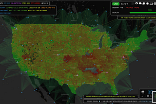
PinnedMike PucholModeling Starlink capacityPrior attempts to calculate Starlink’s potential for service have been theoretical. We simulate based on the actual constellation.19 min read·Oct 2, 2022--4--4
Mike PucholNo, GPT-4 is not going to get developers fired (yet)…I tried to see for myself if ChatGPT could take away a decent software developer’s job, by throwing a simple trigonometry problem at it.11 min read·Mar 31, 2023----
Mike PucholFlammable clouds — part deux: What happened at OVH?After my recent article about the fire at the OVH data center in Strasbourg, which destroyed an entire building and thousands of servers…8 min read·Mar 17, 2021----
Mike PucholFlammable cloudsJust before 1AM CET on March 10th, thousands of players were busy hacking away at their bases on Rust, dozens of criminals were busy…11 min read·Mar 12, 2021----
Mike PucholHow & when to email the CEOYou have probably been here before: a product or service you have purchased with your hard-earned cash has failed you. Possibly more than…9 min read·Feb 16, 2021----
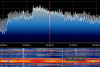
Mike PucholLTE explained… to people like me! — Part 2: modulating the pipesIn Part 1, we examined the fundamentals around how LTE uses increasing amounts of radio bandwidth in order to transmit more data. In this…11 min read·Dec 2, 2020--1--1
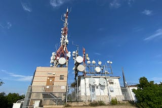
Mike PucholLTE explained… to people like me! — Part 1: radio basicsIn my first post about Loon, I took at look at the flight control characteristics, but also embarked in a three-part series that also…11 min read·Dec 1, 2020----
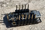
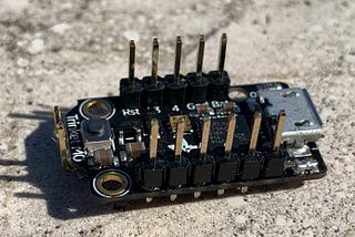
Mike PucholMaking the Adafruit Trinket M0 more usefulIn the world of embedded devices and Arduino-compatible development boards, tradeoffs between cost, functionality, and processing…3 min read·Nov 29, 2020----
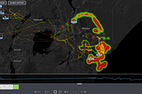
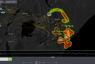
Mike PucholA curious engineer peeked under the hood of a Loon…How is Loon doing five years after my first analysis? First in a three-part series, looking into Loon’s deployment in Kenya15 min read·May 4, 2020--1--1